Focus Groups

Focus Group

Brand

Shea Homes Trilogy Community

Cross Collateral Branding

Shea Homes Trilogy Community

Creating a brand that resounds with the target audience is no small endeavor.

Shea Homes has created a division called Trilogy that is specially designed for the Baby Boomer generation.  Every detail of each community is architected to maximize luxury and amenities for this age category, bringing them a high standard, fun and active quality of life.

To help formulate the initial brand imaging and communication a lot of research and market testing was conducted to be sure that the new brand resonated with this specific market.  Every element from the logo, name and each design element was constructed specifically for the market segment to engage them and connect.

Shea Homes listened to it’s audience and built what they asked for.  Today, there are over 15 cities that have a 55+ Shea Homes Trilogy community.

Client: Shea Homes Trilogy

Category: Brand Development
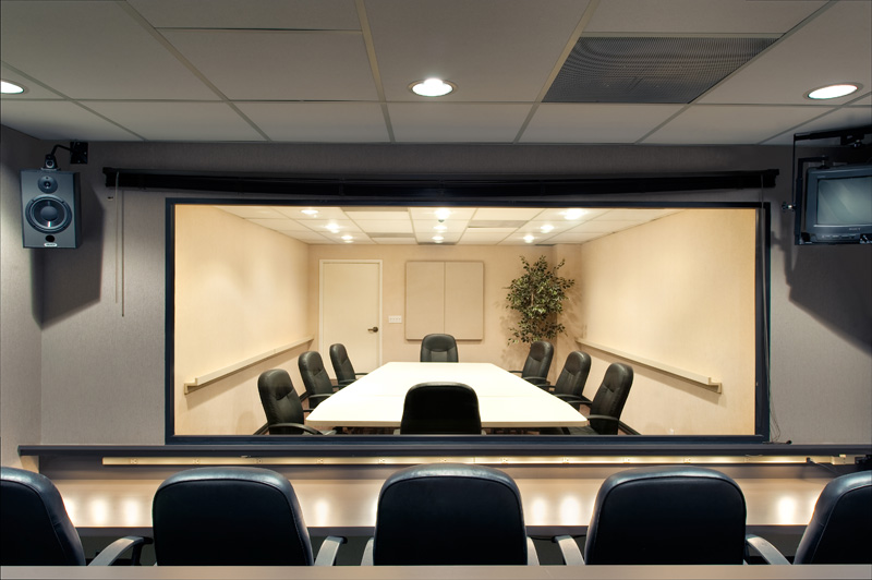
 

Focus Group

Researched and consulted the data that needed to be collected before the creation of the Shea Homes Trilogy brand.  Designed and wrote the focus group interview and process to maximize feedback.  Designed and wrote the perimeters by which the focus group participants would be selected to hand pick people that would represent the future customer.  Directed and guided the focus group event. Collected, analyzed and created detailed reports of the data. Consulted on the data results and the impact on the brand creation and design of the user interface online for this particular retirement market.

Logo Development

Helped develop design comps of the future brand of Shea Homes Trilogy. The logo had to be simple, cross collateral for print, online and physical signage.  It had to communicate and connect with the concept of moving from one stage of life to the next in an encouraging and inspiring way.

Data Designed

All of the data collected, analysed and applied to the design plan was then integrated into all aspects of design.  Specifically this impacted the size of font, buttons, placement and visuals. The market results showed that this particular market had a hard time reading any element that was too small or hard to find.  The preference was for clean, vibrant, easy to navigate architecture and design.